Article by John Tribbia
The technical version of this post, with full statistical details, model specifications, and reproducible code, is available here.
Every AI company tells the same story: better models, more engagement. The claim feels obvious until you try to prove it with data.
Here’s the problem. When a company rolls out a new AI model, everything else changes too. There’s a press cycle. New features ship alongside it. Marketing ramps up. Maybe it’s the start of a new quarter and everyone’s trying to hit goals. Engagement goes up, sure, but claiming the model caused that is like saying your umbrella made it rain.
I wanted a way to test this with the data companies already have. A/B experiments are ideal, but in fast rollout cycles they are often an afterthought.
I also wanted to answer the next question: if quality drives retention, where should you invest next? If you can measure quality’s effect at the category level (coding, creative writing, math), you can build a quality investment map that shows which improvements buy the most retention per dollar.
Because the framework runs on synthetic data with a known answer programmed in, I can offer something most observational analyses cannot: a direct accuracy check. The method recovers 90% of the true effect, and the remaining 10% comes from a well-understood, correctable source of noise.
Why Within-Version Variation Matters
The core idea is simple. Even when every user is on the same AI model, users do not get the same quality of experience.
A software engineer mostly asks the AI to write code. A novelist uses it for creative writing. A student uses it for math homework. AI models are not equally strong across all of those tasks. A model may be excellent at coding and weaker at creative writing.
That means the engineer is getting a better product experience than the novelist, even though they’re using the exact same model. And that difference has nothing to do with when the model was released. It’s baked into how each person uses the tool.
This is the variation I exploit. Instead of comparing “before the upgrade” to “after the upgrade” (which is still valuable, but can be muddled by everything else that changed), I compare users within the same model version who happen to get different quality levels because of what they use the AI for.
Data and Simulation Design
I built a synthetic dataset that simulates a Gemini-style AI assistant: 100,000 users, three model versions rolled out over six months, about 1.65 million weekly records total.
The critical ingredient is a known causal effect baked into the data. I know exactly how much quality should affect engagement because I programmed it in. That lets me test whether the method recovers the right answer instead of only asking whether a result is statistically significant.
The model quality scores look like this across five prompt categories:
| Category | v1.0 | v1.1 | v1.2 |
|---|---|---|---|
| Coding | 3.50 | 4.11 | 4.41 |
| Creative Writing | 2.79 | 3.29 | 3.77 |
| General Q&A | 3.50 | 3.88 | 4.17 |
| Math/Logic | 2.91 | 3.50 | 4.13 |
| Scientific | 3.29 | 3.60 | 4.06 |
Notice how the improvement isn’t uniform. Under v1.0, Coding scores 3.50 while Creative Writing scores only 2.79. That gap between categories is what makes the whole analysis possible. A coding-heavy user and a writing-heavy user are living in meaningfully different quality worlds, even under the same model.
This table also points to where to invest. If you are deciding where to spend your next round of model fine-tuning, you need to know which categories would move the most users if improved. That requires combining quality data with usage data, which is exactly what this framework does.
Identification Strategy
For each user, I calculate a personalized quality score based on what they actually use the AI for. A software engineer who spends 41% of their time on coding tasks and 5% on creative writing gets a quality score weighted heavily toward the coding ratings. A novelist with the opposite mix gets a very different score. I call this a user’s quality of AI experience.
Then I subtract the average. This step strips away everything that changes when a new model rolls out (marketing, press, coincidental timing) and leaves the structural difference between users who benefit more or less from the current model’s strengths.
Here’s a concrete example under v1.0:
- A software engineer (mostly coding): quality experience = 3.30 (above the 3.23 average)
- A creative writer (mostly writing): quality experience = 3.02 (below average)
Same model, same week, different experience. The question is whether that 0.28-point gap predicts any difference in engagement.
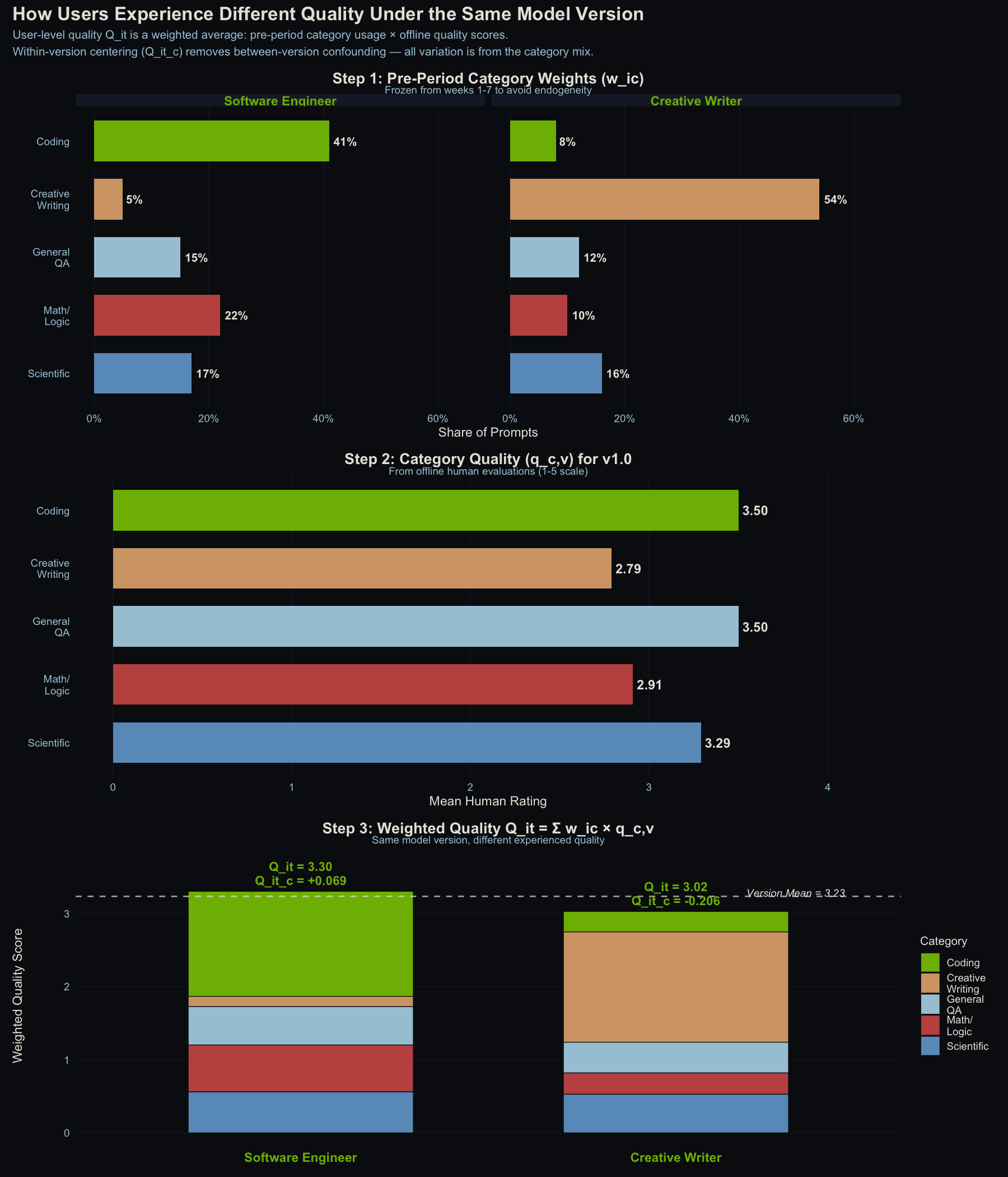
How user-level quality experience is constructed. Top: pre-period category weights for two example users. Middle: quality scores by category for v1.0. Bottom: stacked weighted contributions. Same model version, different experienced quality. The dashed line is the population mean.
What You Need to Run This
-
Category-level quality scores. A single overall quality rating per model version won’t work. You need to know how good the model is at coding separately from how good it is at creative writing.
-
Prompt-level usage logs. You need to know what each user is actually doing with the AI rather than relying on aggregate session counts. Having a category-level taxonomy is key here and can help with privacy protocol when handling user-level prompts.
-
A holdout group (ideally). This observational approach works, but even a small 90/10 staggered rollout would make the causal story much stronger.
Results
Before getting into the model results, it’s worth seeing the raw data. The chart below shows what quality exposure looks like over time: first the raw scores (which jump at each deployment boundary), then the centered scores that strip away those jumps and reveal the within-version spread we actually use.

Top: Raw quality scores show obvious step-function jumps at deployment boundaries, the variation we can’t use. Bottom: Centered scores show only the within-version spread between users. That’s the variation that drives the analysis.
Quality predicts return frequency, not prompt volume
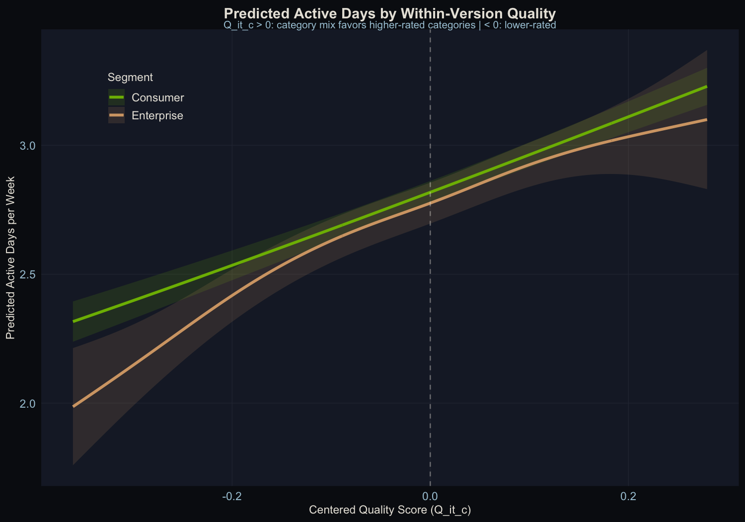
The relationship between centered quality and engagement is highly significant for one metric and absent for another:
- Active days per week: Strong positive relationship. Users whose category mix aligns with the model’s strengths are active more days per week.
- Number of prompts: No relationship at all. Quality doesn’t change how much people do once they open the app.
This pattern is intuitive. Quality affects the “should I open this today?” decision, not the “how many questions should I ask?” decision. If the AI is good at what you need, you are more likely to return tomorrow. Once you are there, you ask as many questions as you have. Other performance dimensions like latency and punt rate can be added as predictors, but this analysis isolates quality.

Top left: Clear positive relationship between quality and active days. Top right: No meaningful time trend after accounting for version. Bottom left: Quality has zero effect on prompt volume. Bottom right: Rich temporal dynamics in prompts driven by other factors.
Recovery Against Known Ground Truth
This is the payoff of using synthetic data with a known answer. I programmed in an effect of exactly 1.0 (on a statistical scale called log-odds). The method recovered 0.90, or 90% of the true value.
The 10% it missed is explainable: the method uses observed usage patterns, which are noisy approximations of people’s true preferences. That noise systematically pulls the estimate toward zero. It’s a well-understood statistical phenomenon, and it’s correctable.
When I used a more sophisticated error-correction technique (cluster bootstrapping, which accounts for the fact that the same person shows up multiple times in the data), the confidence interval captured the true value. The simpler approach narrowly missed it, which is exactly the kind of thing that matters in production.
Consistency Across User Types

Both consumer and enterprise users show significant quality effects, with similar slopes. This confirms the method works at the subgroup level. It also means you can run segment-specific investment maps, and because enterprise users often concentrate on different categories than consumers, the optimal investment can differ by segment.
Falsification Check
The most important result from this analysis might be the one that didn’t find anything. In an earlier iteration of the project, before I injected the known causal effect, the falsification test came back clean: no signal detected. That’s what gives me confidence the method isn’t just picking up noise or artifacts when it does find something.
The test works like this: shuffle which users get which quality scores, and scramble the assignment of quality exposure across users within the same model version so there is no real signal left to recover. If the method is working correctly, the shuffled version should come back empty.
In this data, the permuted model returns beta = -0.106, p = 0.265, with no signal as expected. That clean null increases confidence that the real result (beta = 0.877, p < 10^-19) is capturing something genuine rather than a statistical artifact or lucky timing.
What This Means for Product Teams
The Estimator Is Practical
The within-version approach can isolate quality’s contribution to engagement without an A/B test. It recovers 90% of a known effect, and the remaining 10% comes from a well-understood and correctable source of error. That’s good enough for production decision-making.
Before/After Comparisons Are Misleading
Comparing engagement before and after a model upgrade tells you almost nothing about the model itself. The version-level jumps in this data are four to five times larger than the within-version quality effect. Most of that jump is more than just the model. It’s also everything else that changed at the same time.
A head-to-head comparison with four alternative estimators confirms this directly. Naive OLS (without version fixed effects) recovers only 67% of the true effect. Using real-time weights that let the outcome influence the predictor drops recovery to 50%. The proposed method reaches 88%, with the remaining gap fully explained by classical measurement noise.
Quality Moves Retention, Not Session Intensity
If you’re trying to justify model investment to your leadership, “better models bring people back more often” is a defensible claim. “Better models make people use it more per session” is not supported by this framework. That distinction matters for how you think about the ROI of model improvements.
Turning the Estimate into an Investment Plan
The real power of this framework isn’t just knowing that quality affects retention. It’s knowing where to invest next.
Because the quality score is built from category-level ratings weighted by each user’s usage mix, you can decompose the overall effect into category-level contributions. That gives you a quality investment map: which categories have the highest marginal return on quality improvement for retention?
Here’s a concrete example. Take the v1.0 quality scores and the average usage weights from the data:
| Category | Quality (v1.0) | Avg. User Weight | Gap to Best |
|---|---|---|---|
| Coding | 3.50 | 24.6% | - |
| General Q&A | 3.50 | 20.4% | - |
| Math/Logic | 2.91 | 21.4% | 0.59 |
| Scientific | 3.29 | 18.4% | 0.21 |
| Creative Writing | 2.79 | 15.1% | 0.71 |
Creative Writing has the largest quality gap (0.71 points below the best categories), but only 15.1% of usage falls there. Math/Logic has a smaller gap (0.59) but 40% more usage (21.4%). If you could improve only one category, Math/Logic buys you more retention because more people rely on it.
That is the quality investment map. It tells a product team to fix the categories that combine weak quality with heavy usage. You can run this analysis by segment too. If enterprise users skew heavily toward Coding while consumer users spread across categories, the optimal investment differs by segment.
Counterfactual Lift in Retention Units
The gap table tells you which direction to invest, but not how much retention you’d actually gain. So I ran proper counterfactual simulations: pick a hypothetical improvement, recompute every user’s quality score, run it through the fitted model (using the recovered coefficient of 0.90 log-odds), and get predicted retention deltas in real units.
Four scenarios, starting from the v1.0 baseline (2.85 active days/week):
| Scenario | Delta Active Days/User/Week | % Change | Per 100K Users |
|---|---|---|---|
| Coding +0.5 | +0.175 | +6.1% | +17,533 days/wk |
| Math/Logic +0.5 | +0.149 | +5.2% | +14,905 days/wk |
| Creative Writing +0.5 | +0.106 | +3.7% | +10,626 days/wk |
| All Categories +0.2 | +0.283 | +9.9% | +28,285 days/wk |
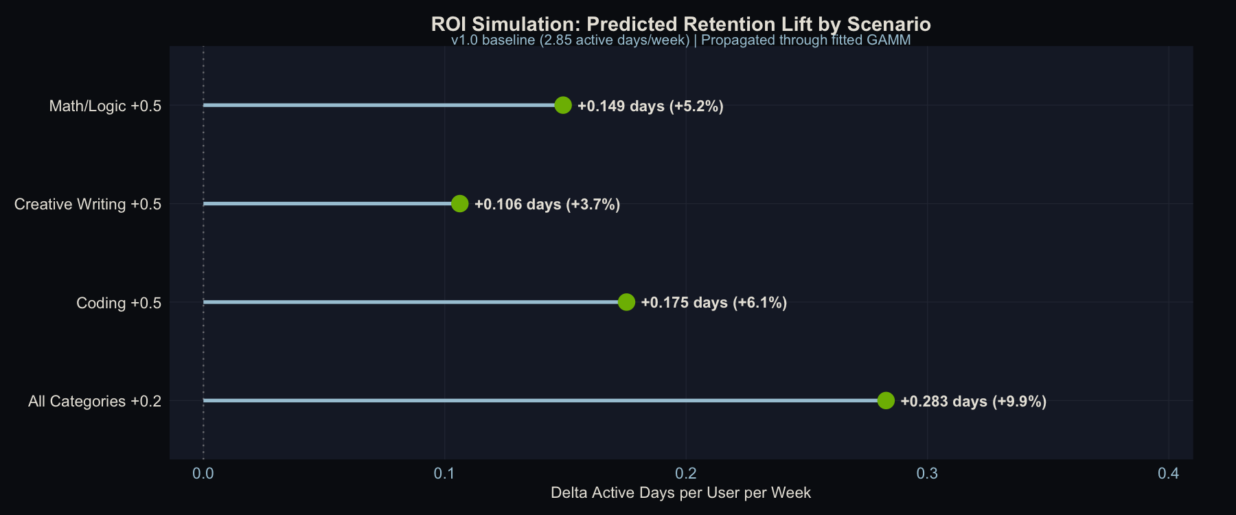
Predicted retention lift by improvement scenario. The “All Categories +0.2” scenario uses a smaller per-category improvement but lifts every user, producing the largest aggregate gain.
The ranking of scenarios is predictable from the usage weights alone, but the magnitudes are not, and the magnitudes are what make this actionable. Coding +0.5 beats Math/Logic +0.5 because more users rely on Coding (24.6% vs. 21.4%), even though Math/Logic has a larger quality gap. Creative Writing +0.5 finishes last despite having the biggest gap because only 15.1% of usage falls there. You could have guessed that ordering from the gap table, but you couldn’t have known that the difference between Coding and Creative Writing is worth roughly 7,000 extra active-user-days per week at scale.
The most strategically important result is the last row. The uniform improvement (“All Categories +0.2”) dominates every targeted scenario even though each category gets only 0.2 points instead of 0.5. It lifts every user, not only users who rely on one improved category. Many product teams prioritize the weakest category first, but these results favor broad quality investment over single-category fixes.
The per-user effects are modest (0.1 to 0.3 extra active days/week) because the within-version quality spread is narrow. In production data with wider category gaps, these deltas would be larger.
This is the kind of table a product team can take to a planning meeting: “Improving Coding quality by half a point is worth roughly 17,500 extra active-user-days per week across our 100K user base.” It is a quantified outcome instead of a directional claim.
One thing this framework cannot tell you is whether a quality improvement drives retention because it is genuinely better, or because it feels novel. A big jump in Creative Writing quality might bring users back for a few weeks because it is new and surprising, not because the sustained level matters. Distinguishing novelty effects from durable quality gains would require cohort-based analysis: tracking whether users who first experience an improvement show a different retention trajectory than users who arrive after it becomes the new normal. That is a natural next step, but it is a different analysis.
This distinction has real stakes for how you act on the signals this framework produces. If you use a one-month retention lift as the signal to double down on Creative Writing investment, but that lift is novelty rather than durability, you’ll over-allocate to improvements that have already delivered most of their value. A practical guard: track whether the retention gain for new cohorts (users who arrived after the improvement) matches the gain for early adopters. If early adopters showed a spike and then reverted while new users showed no lift at all, that’s the novelty effect in plain view. Durable quality gains should show up in new-user retention just as clearly as in early-adopter retention, because those users never experienced the before-state.
Conclusion
Many AI companies assume that better models drive more engagement. This project builds a method to test that assumption, validates it on synthetic data with a known answer, and shows that it works. The method is not perfect. The quality variation it exploits is narrow, and observational designs always carry caveats. Still, it is a principled starting point that any team with the right data can implement.
All data in this analysis is synthetic. No real users, no proprietary models, no production systems. The goal is to demonstrate a methodology, not report findings from an actual deployment. Full code and datasets are available in the technical write-up.
Ideas, analysis, and opinions are my own. Generative AI was used as an editor after the writing and analysis were complete — sentence restructuring and light copy-editing. The author reviewed all suggested changes.